


Logos have the power to symbolize not just a business or event, but an entire brand and feeling. A simple logo can evoke feelings like movement, playfulness, unity or grandeur. Here are just a few of the logos that have stood the test of time.
The Rolling Stones
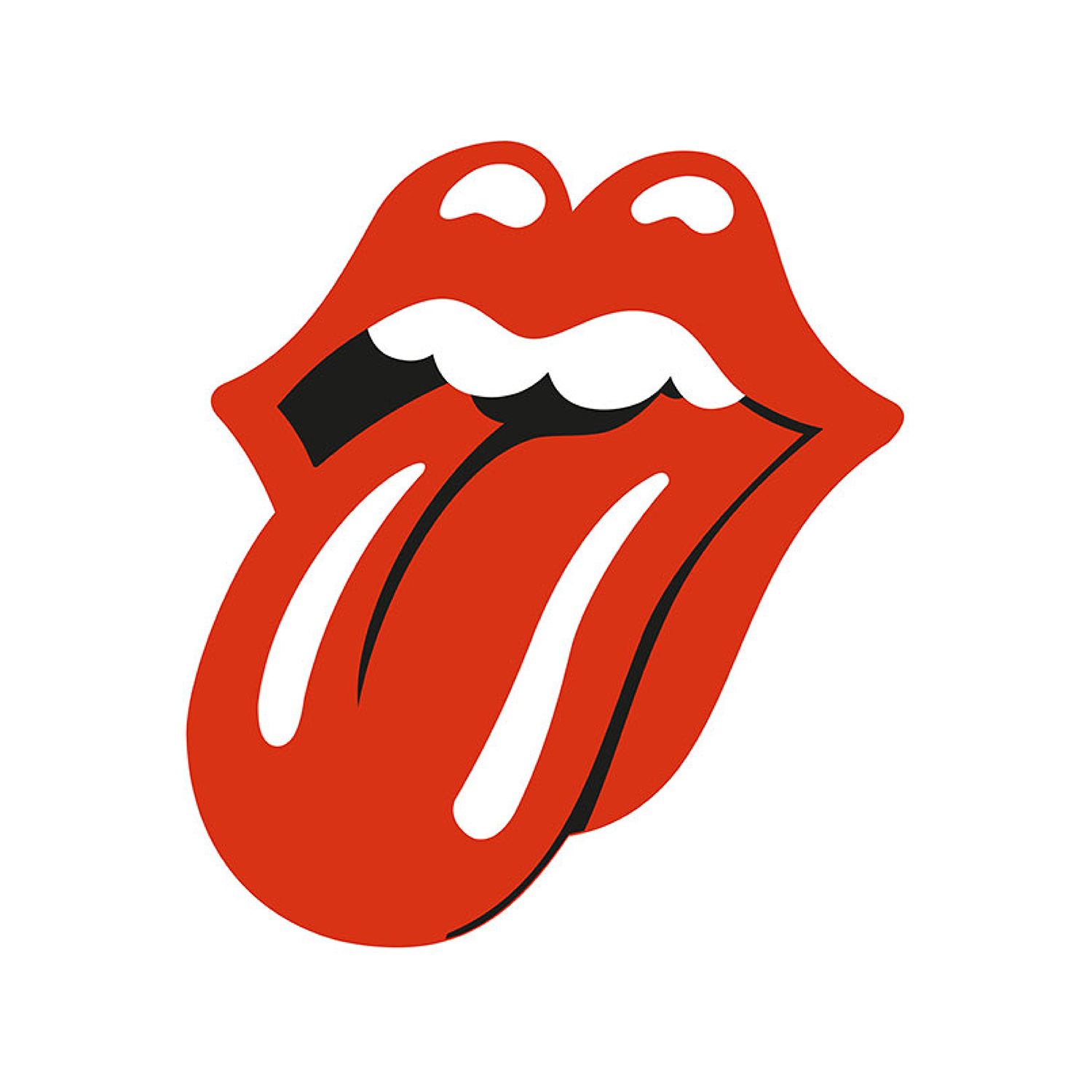
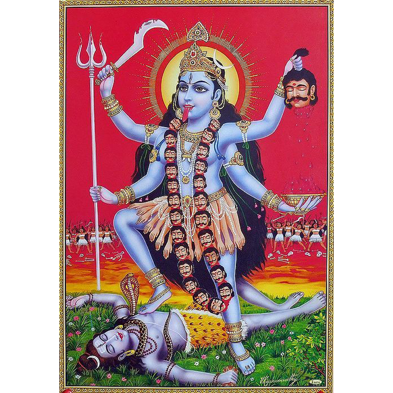
The Rolling Stones tongue and lips logo was designed by Jon Pasche, a British graphic designer. He started his creative partnership with the band by designing tour posters for Mick Jagger. Eventually Mick Jagger commissioned Jon to design a logo for the band. Mick Jagger was originally inspired by the Indian goddess Kali who is often depicted with her tongue out. Jon made a softer, more playful version that looked closer to Mick Jagger’s actual lips. The rest of the band loved it, Jon received his pay of 50 pounds and the rest is history.
Nike
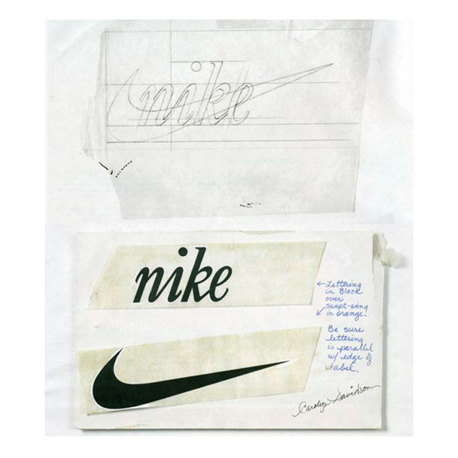
When Blue Ribbon Sports changed it’s name to Nike in 1978, they asked a graphic design student named Carolyn Davidson to make their new logo. Nike is named after the Greek goddess of victory. The Nike swoosh, when put on both shoes, is meant to resemble the goddess’ wings. Davidson was paid just $35 ($2 per hour) for creating the iconic ‘swoosh’ logo that we all know today.
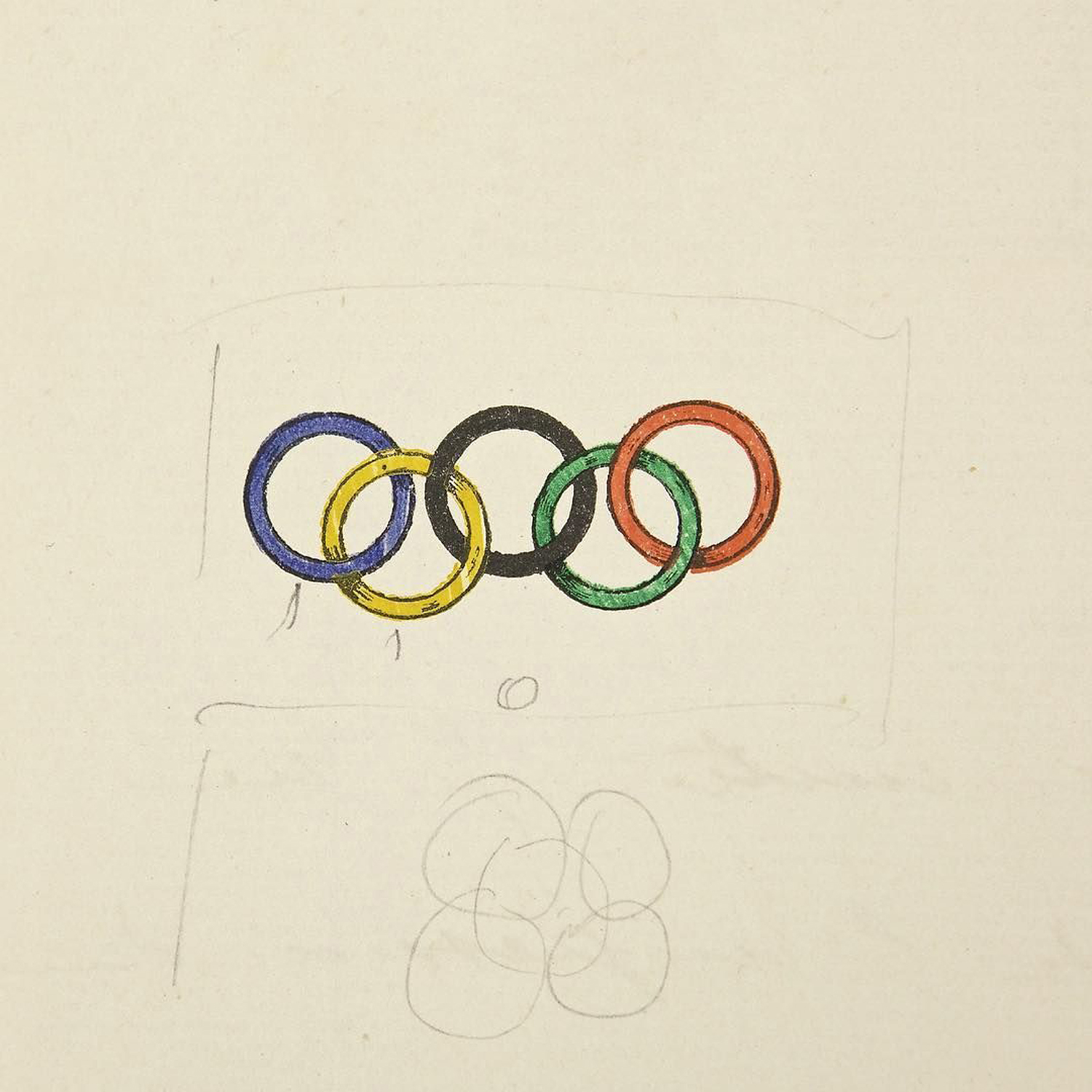
The Olympics
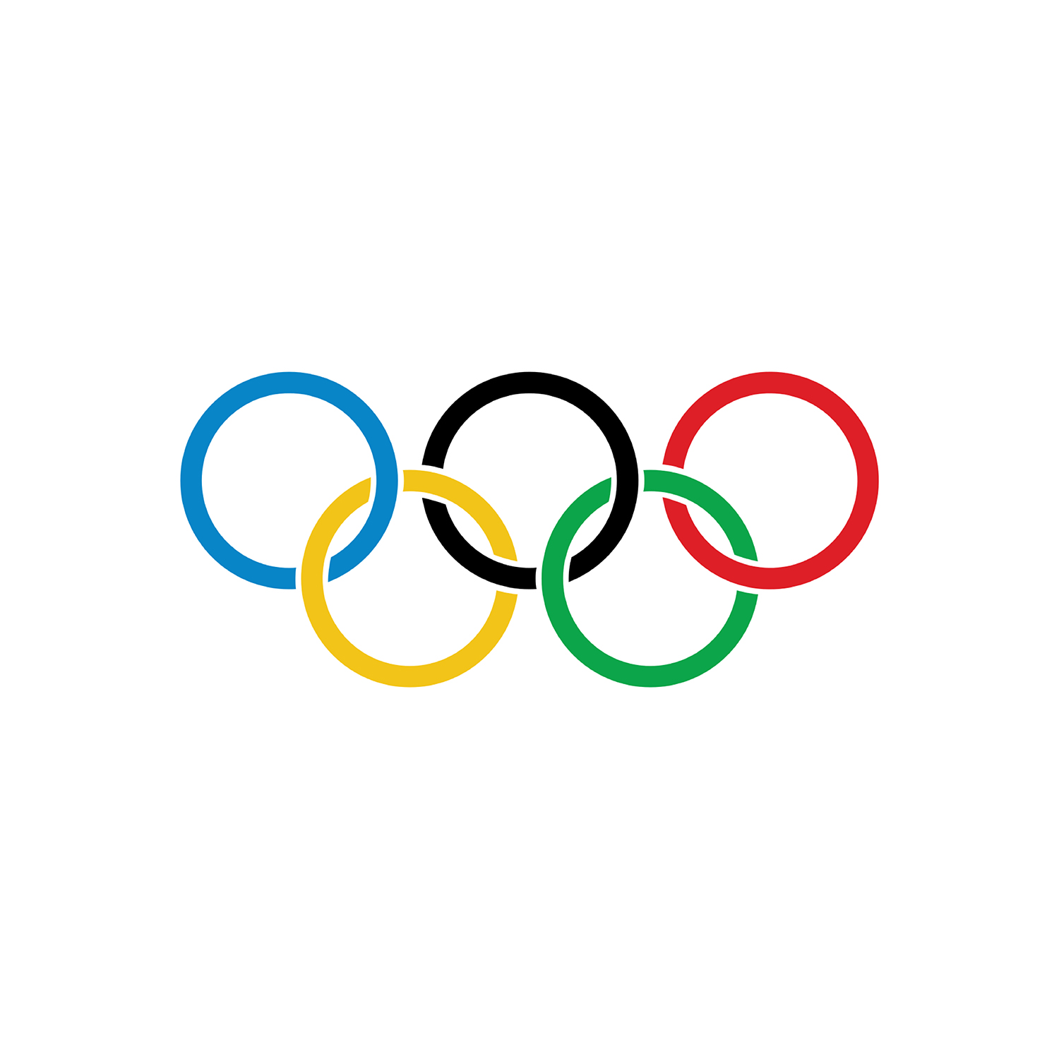
The original Olympics logo was designed by french aristocrat Pierre de Coubertin in 1912. Pierre was an educator, historian and founder of the International Olympic Committee. He drew the interlocking rings to symbolize the 5 continents which he described as “Africa, Asia, America, Australia and Europe”. The colors were chosen because they were popular colors on national flags.
McDonalds
In the 1950’s McDonalds founders decided to simplify their menu burgers and revamp their restaurants to create their vision of what’s now considered “fast food”. They wanted to be eye-catching and also encourage customers to quickly move in and out. They worked with architect Stanley Clark Meston who suggested using large golden arches to stand out. The arches were later re-purposed by designer Jim Schindler to create and M shape for a “more corporate logo”.
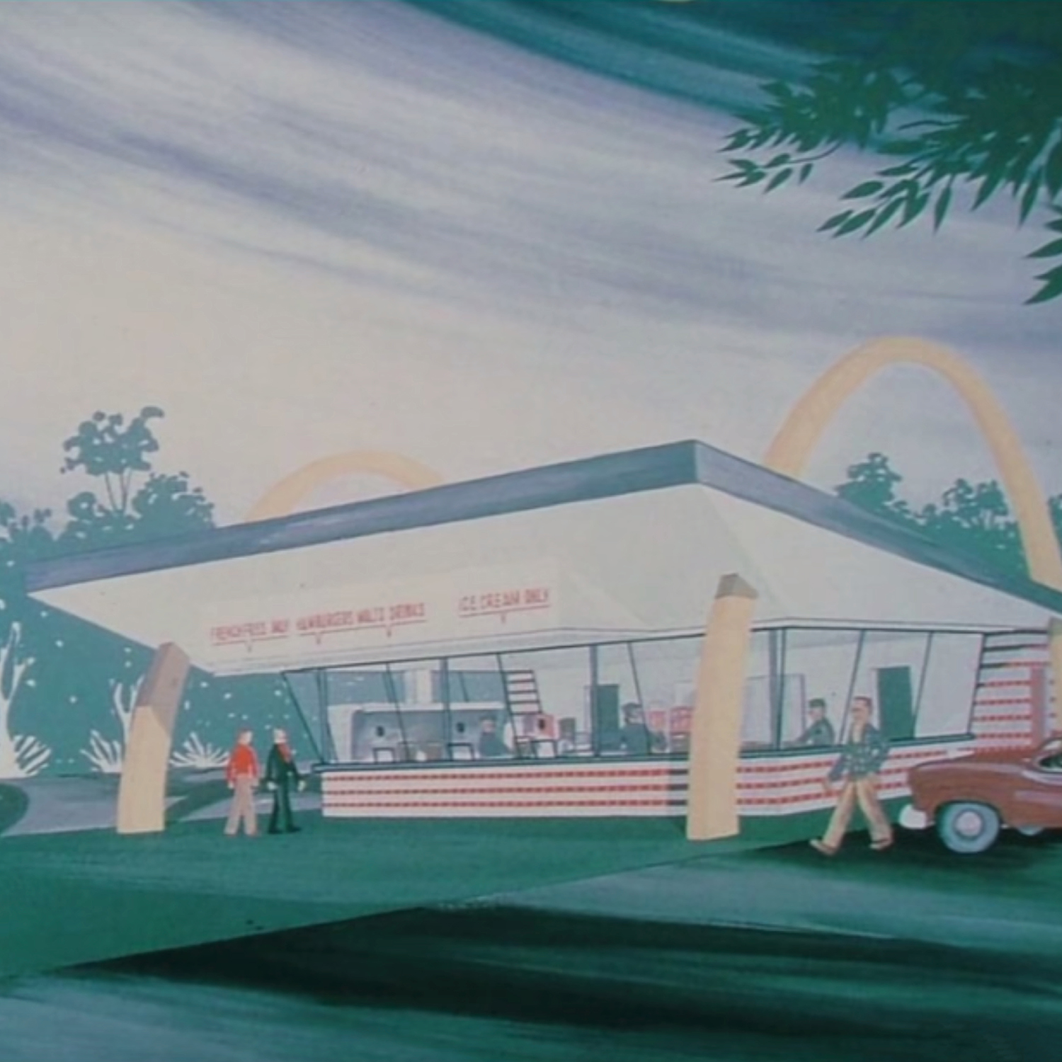
Alan Hess architecture rendering
Coco Chanel
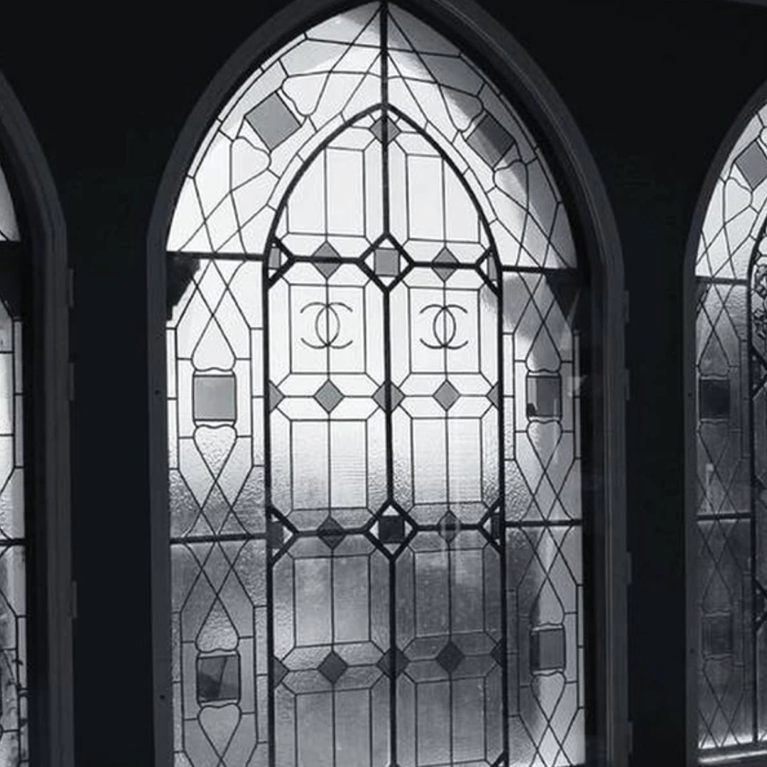
The interlocking, opposite-facing Cs of Coco Chanel was created by the brand’s namesake in 1925. The story behind the inspiration of the logo is very mysterious. Some say it was probably inspired by the french cathedrals that Coco used as inspiration for her collections too. A simpler version of the logo can also be found in Château de Crémat which was owned by a friend of hers. Legend has it her friend gave her permission to use the vineyard’s symbol for her brand. Another theory a stained-glass window in the Aubazine Chapel, where Coco spent a lot of time during her childhood (pictured below).
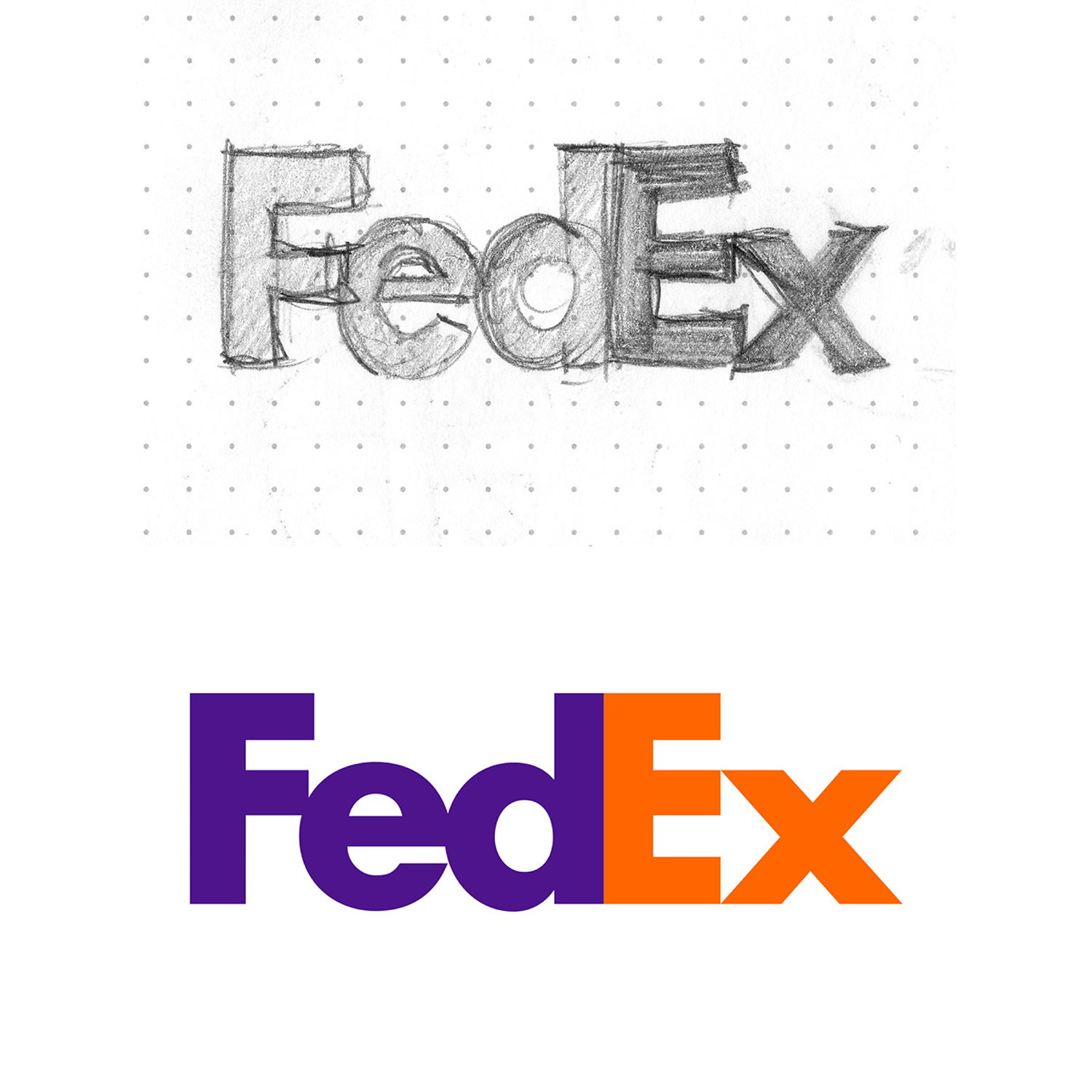
FedEx
The iconic FedEx design was created by Lindon Leader in 1994. Previously known as Federal Express, Lindon encouraged the company to shorten the name to FedEx for the sake of simplicity and branding. While playing with the logotype, Lindon noticed a small arrow appear between the uppercase ‘E’ and lowercase ‘x’. When he presented this idea, the company’s PR firm suggested making the arrow a different color so it was more noticeable but Lindon fought back, arguing “It wasn’t about the arrow. An arrow isn’t even interesting to look at. It’s only because of the subtlety that it’s intruiging”. He got his way and the logo went on to become a legend in the design world.
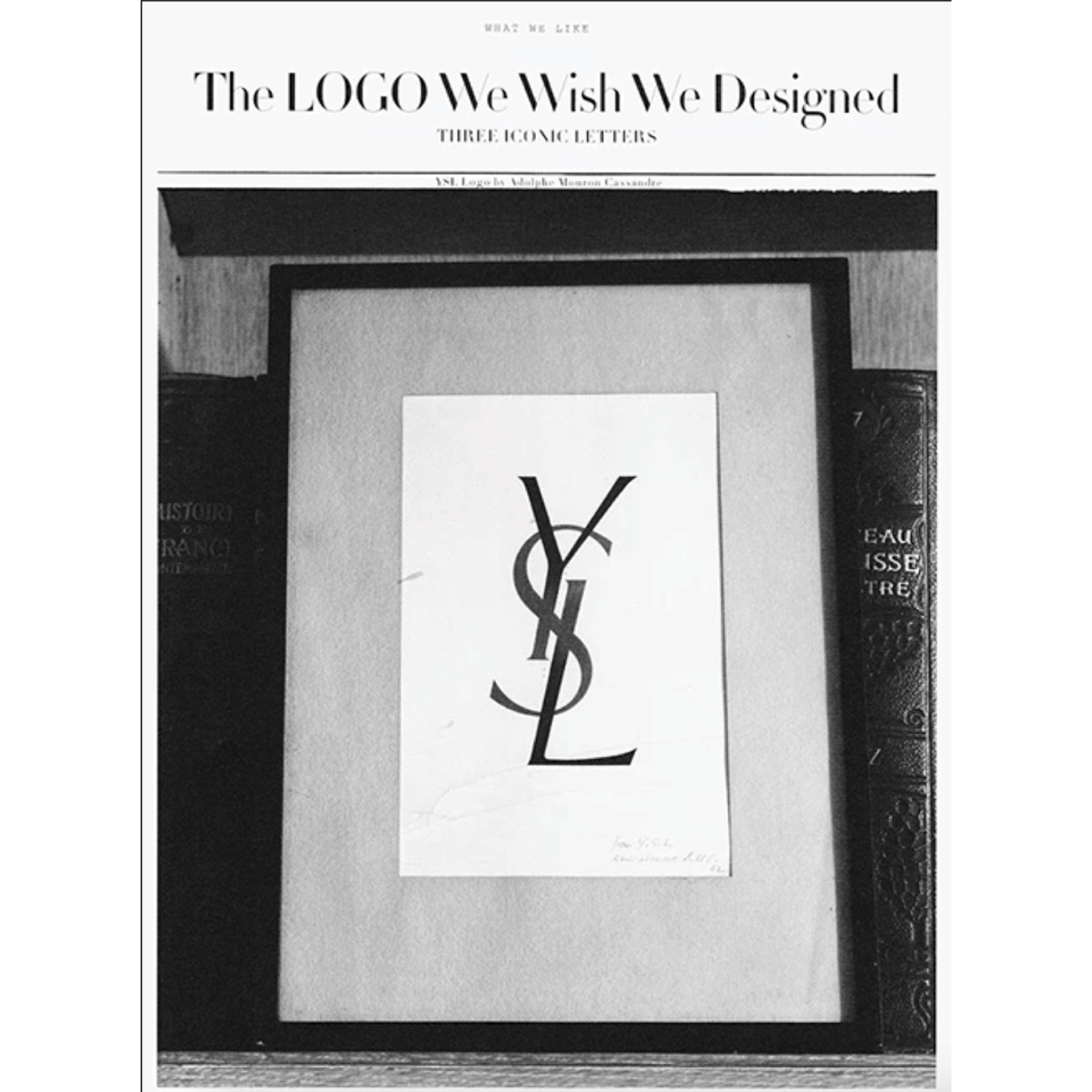
Yves Saint Laurent
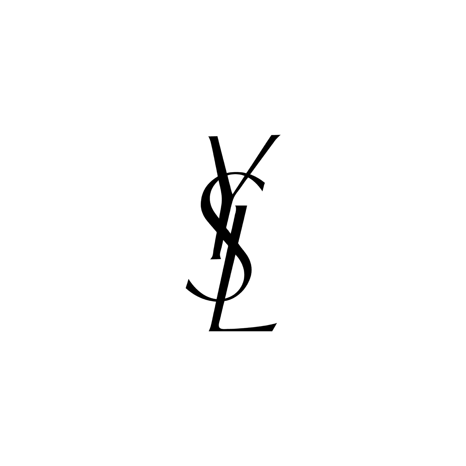
The luxurous YSL icon for Yves Saint Laurent was designed by Ukranian-French painter and poster artist, Adolphe Mouron Cassandre. Cassandre’s other work was heavily influenced by cubism and surrealism. He also designed a number of typefaces that are still used today.
At Neiter Creative we always draw inspiration from these iconic logos when we’re designing a new brand for clients. To see what logos we’ve made visit our portfolio or check us out on instagram!