


Color Isn’t Just a Vibe—It’s a Strategy
Think back to Kindergarten, when “What’s your favorite color?” was the ultimate icebreaker. The answer was simple: pink, purple, blue, or green. Little did you know that color perception was already shaping how you saw (and judged) the world.
Color is hardwired into human psychology. It sparks emotions, influences decisions, and leaves a lasting impression. Whether we realize it or not, we make snap judgments based on color every single day.
From traffic lights to fashion, interior design to Instagram aesthetics, color is the unspoken language that guides our choices. And in branding? It’s one of the most powerful tools in the game.
Color Psychology 101: Why We React the Way We Do
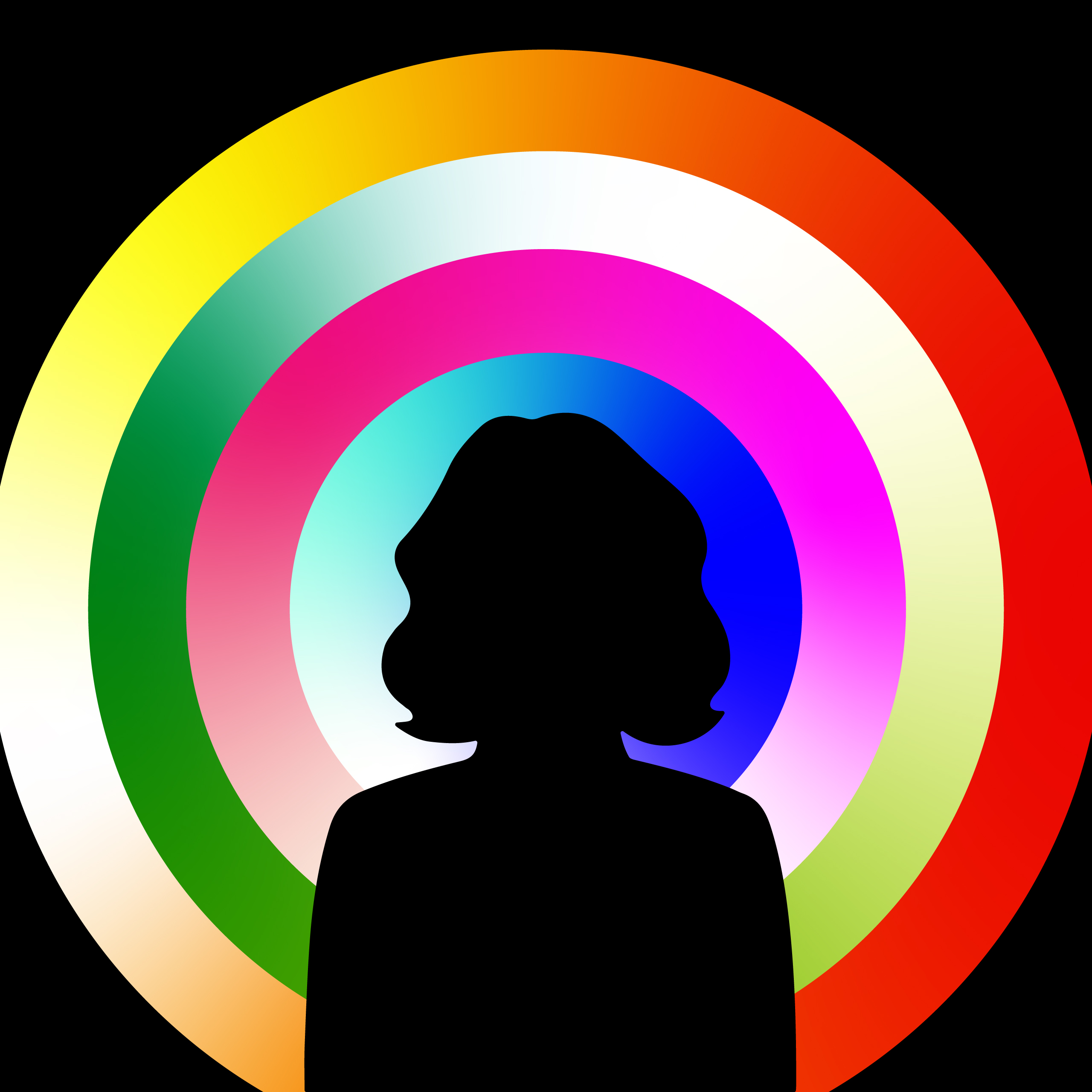
It’s science, not magic. Defined as the study of how color influences human behavior, color psychology affects our moods, attention spans, and purchasing decisions—often without us even realizing it.
Studies show that colors can stimulate or inhibit certain brain regions and hormones (Safi, 2024). That’s why fast food chains douse themselves in red and yellow—these colors literally stimulate hunger.

Every Color Tells a Story
In branding, color isn’t decoration—it’s storytelling without words.
Some color meanings are obvious. Red = fire, blood, urgency, and passion. Blue = sky, water, calm, and trust. Others are more personal. Maybe yellow reminds you of sunshine and summer—or maybe it reminds you of that time you got stung by a bee.
Color isn’t just visual—it’s emotional, cultural, and deeply personal. And that’s exactly what makes it so powerful in branding.
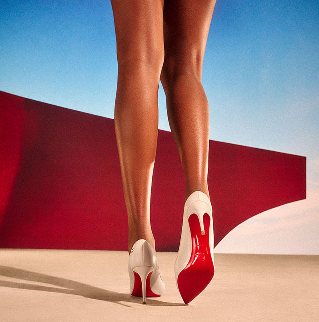
Photo Credit: Christian Louboutin
How Color Defines Your Brand Identity
Let’s get one thing straight—your brand’s color scheme is way more than a pretty palette. It’s your first impression, emotional trigger, and silent ambassador.
Before anyone reads a word or hears your story, they see you—and color is the first thing that speaks.
Think of your brand colors like your uniform—they show up everywhere, from your logo and website to your business cards and packaging. Whether it’s your email signature or your Instagram Highlights, your colors create instant recognition and build trust over time.
The perfect example? Louboutin red.
Christian Louboutin didn’t just pick a random red for his iconic soles—he chose a color that stood for something. Red is desire. Red is power. Red stops you in your tracks. That one bold stroke became a statement, a status symbol, and ultimately inseparable from the brand itself. Proof that color—used with intention—can be just as iconic as the logo itself.
The Strongest Brands Don’t Just Use Color—They Own It
At Neiter Creative, we don’t follow trends when creating color palettes for our clients. We dig deeper. We want to know the colors that remind you of your happy place, your childhood bedroom, or the city that shaped you.
Our goal is to craft a personal, intentional, and powerful palette that is versatile enough to grow with your brand and distinctive enough to stand the test of time.
And remember—color doesn’t always have to live in the logo. Sometimes, it shines brightest in the supporting palette. Website accents, packaging details, or even a curated Instagram feed—every single touchpoint is an opportunity to reinforce your brand’s story through color.
Breaking Down Color Psychology in Marketing
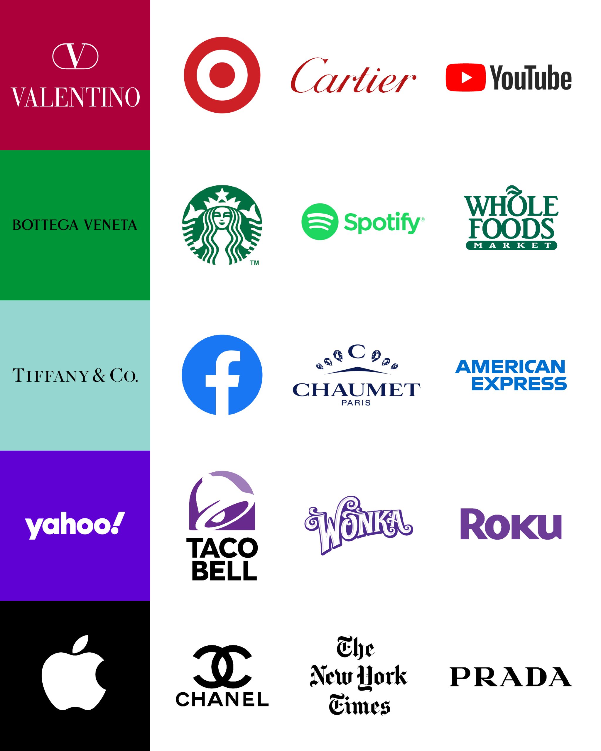
Let’s talk about the heavy hitters and what they bring to the branding table:
Red – Power, passion, strength. Increases heart rate and creates urgency.
Ex: Cartier, Valentino, Target, YouTube.
Green – Nature, renewal, growth. Represents health, wealth, and sustainability.
Ex: Bottega Veneta, Starbucks, Spotify, Whole Foods.
Blue – Stability, trust, calm.
Ex: Tiffany & Co., Chaumet, Facebook.
Purple – Luxury, creativity, mystery. Ideal for high-end, beauty, and creative brands.
Ex: Yahoo, Roku, Wonka.
Black & White – Minimalism, sophistication, timeless contrast.
Ex: Prada, Apple, Chanel, The New York Times.
It’s no accident that certain industries use specific colors—those choices are designed to influence perception, behavior, and brand loyalty.
Some colors work best on your website, while others shine brightest on packaging or in print. Maybe your call-to-action buttons need a bold pop of red, while your overall brand leans toward black and white for timeless appeal. The key? Be consistent. Be intentional. Be unforgettable.
Final Thoughts: Own Your Color Story
Color isn’t just a vibe—it’s a strategy. It’s the first impression, the emotional handshake, and the thread that ties your entire brand story together.
Forget chasing trends—the strongest brands own their colors. They choose palettes that authentically represent their values, speak to their audience, and stand the test of time.
When used strategically, color builds trust, drives engagement, and makes brands instantly recognizable. It influences how people perceive you, how they feel about you, and whether they remember you at all.
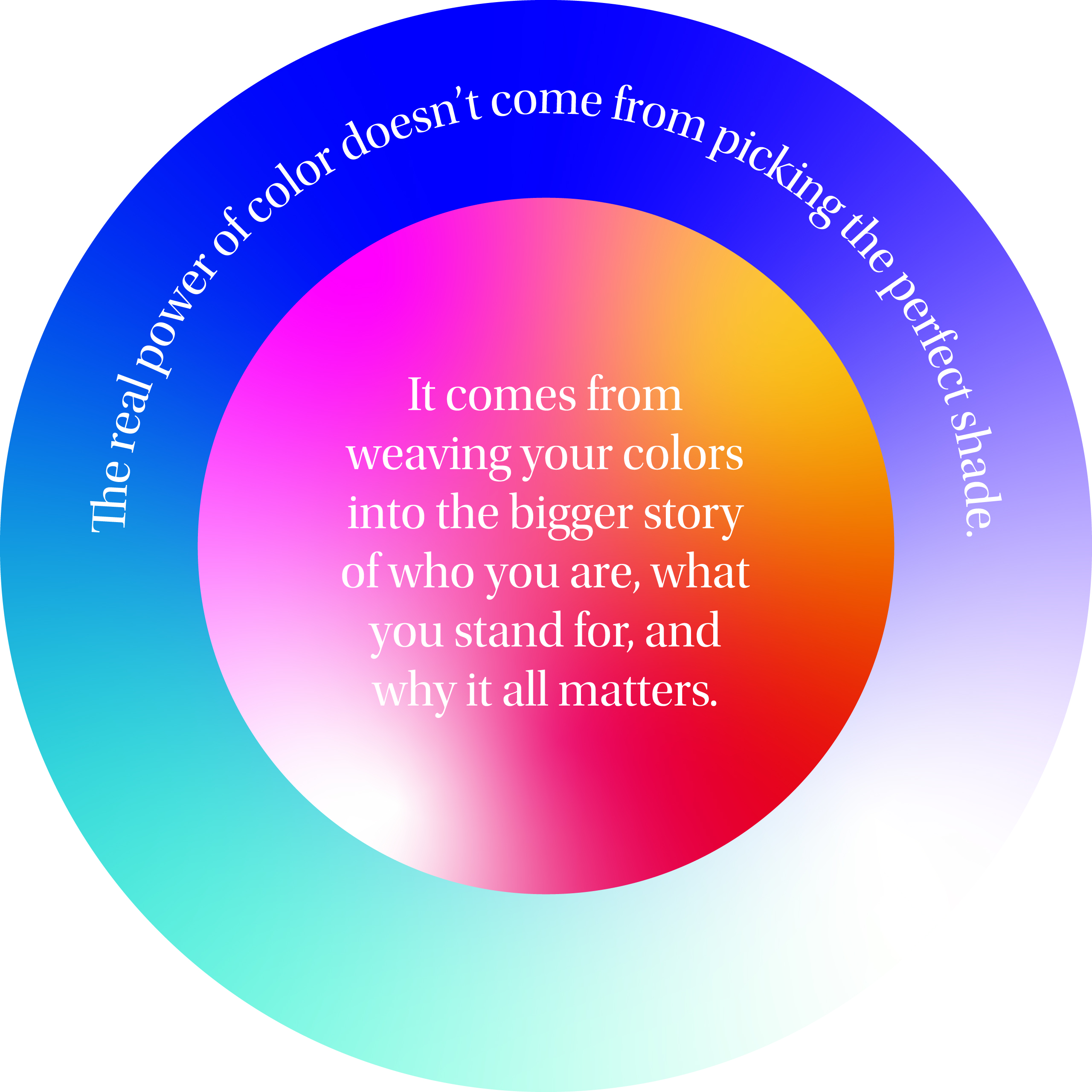
But here’s the thing: Color is deeply personal. It means different things to different people—and that’s okay. The real power of color doesn’t come from picking the perfect shade. It comes from weaving your colors into the bigger story of who you are, what you stand for, and why it all matters.
At the end of the day, color isn’t just how your brand looks—it’s how it feels. Make it count.
Levin, Juliet. “The Psychology of Colors in Marketing & Branding: How to Make Your Brand Speak Without Saying a Word.” The Surprising Science of Color Psychology, 17 Feb. 2024, https://sharleezsafi.medium.com/the-surprising-science-of-color-psychology-8d527d5df8d0.